Gearhead Cloud Logo Design Case Study
Gearhead Cloud, a new IT company, needed a logo that conveyed professionalism, expertise, and reliability. The client requested a simple, clear design that combined a gear and something related to the IT world. They also preferred a font that was clear and familiar to systems.

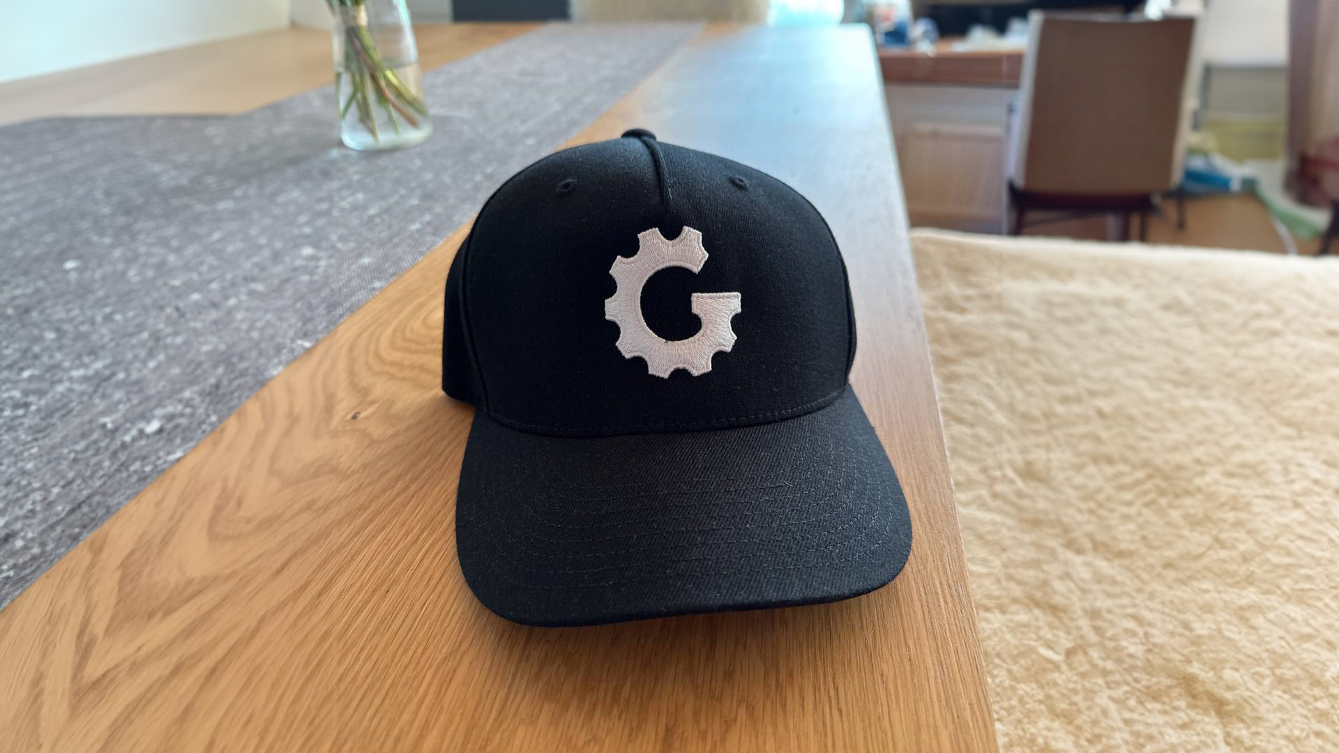
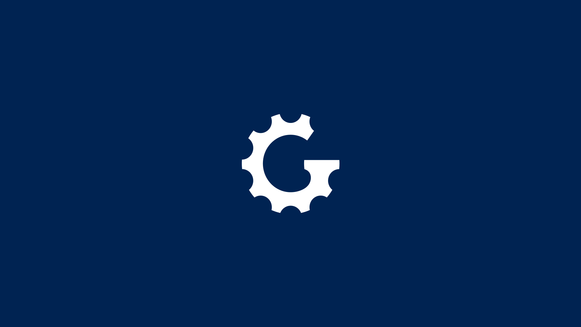
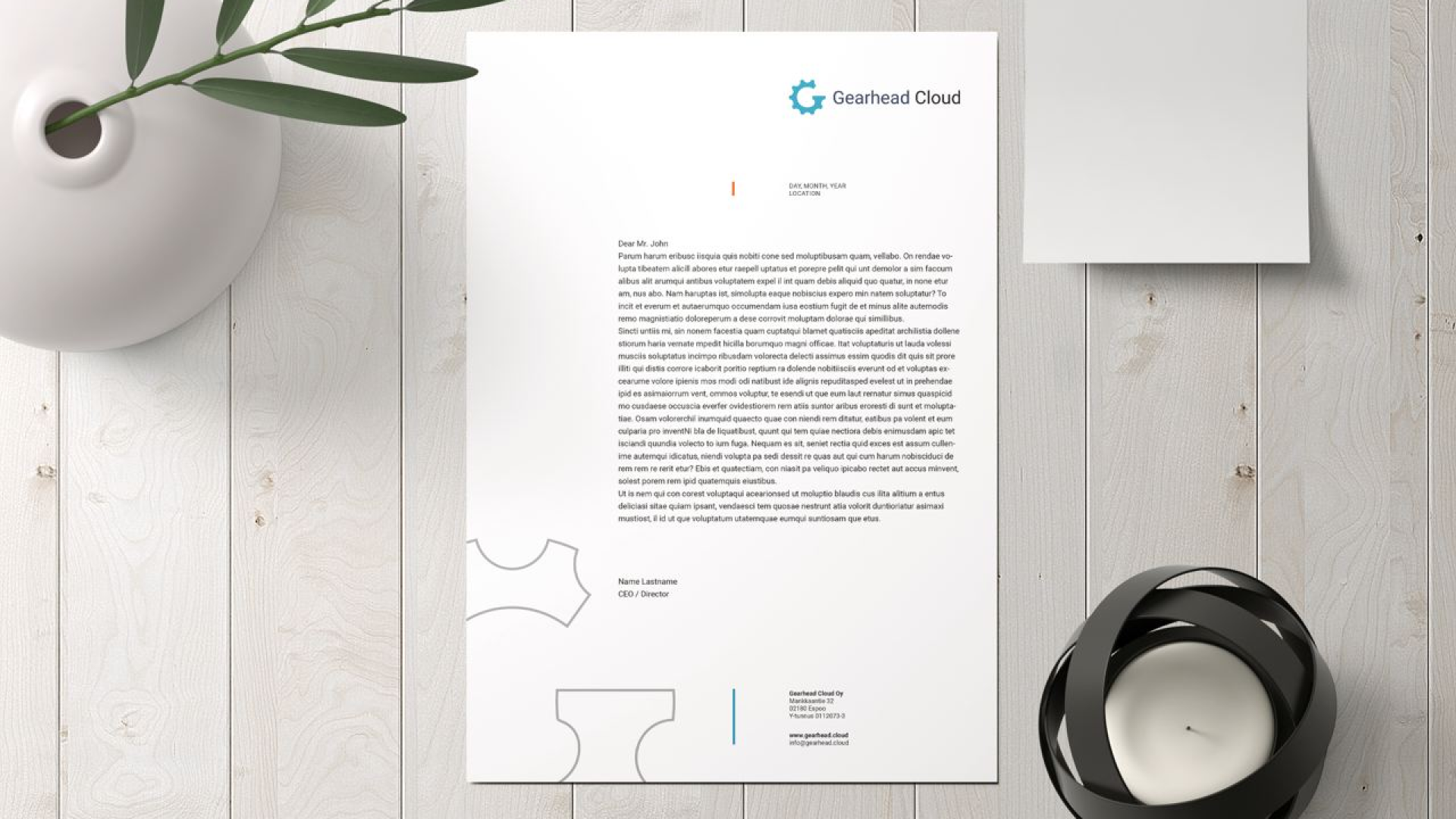
Our team collaborated closely with the client to understand their needs and target audience. We developed a logo that met their requirements and conveyed the brand attributes they wanted to emphasize. The final design incorporated a gear with the initial letter "G" to form a unique and memorable visual identity.

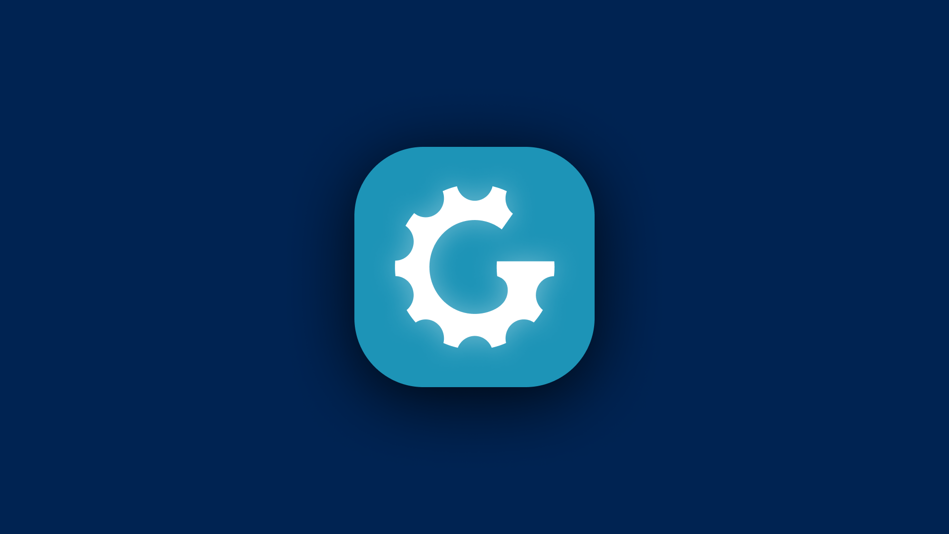
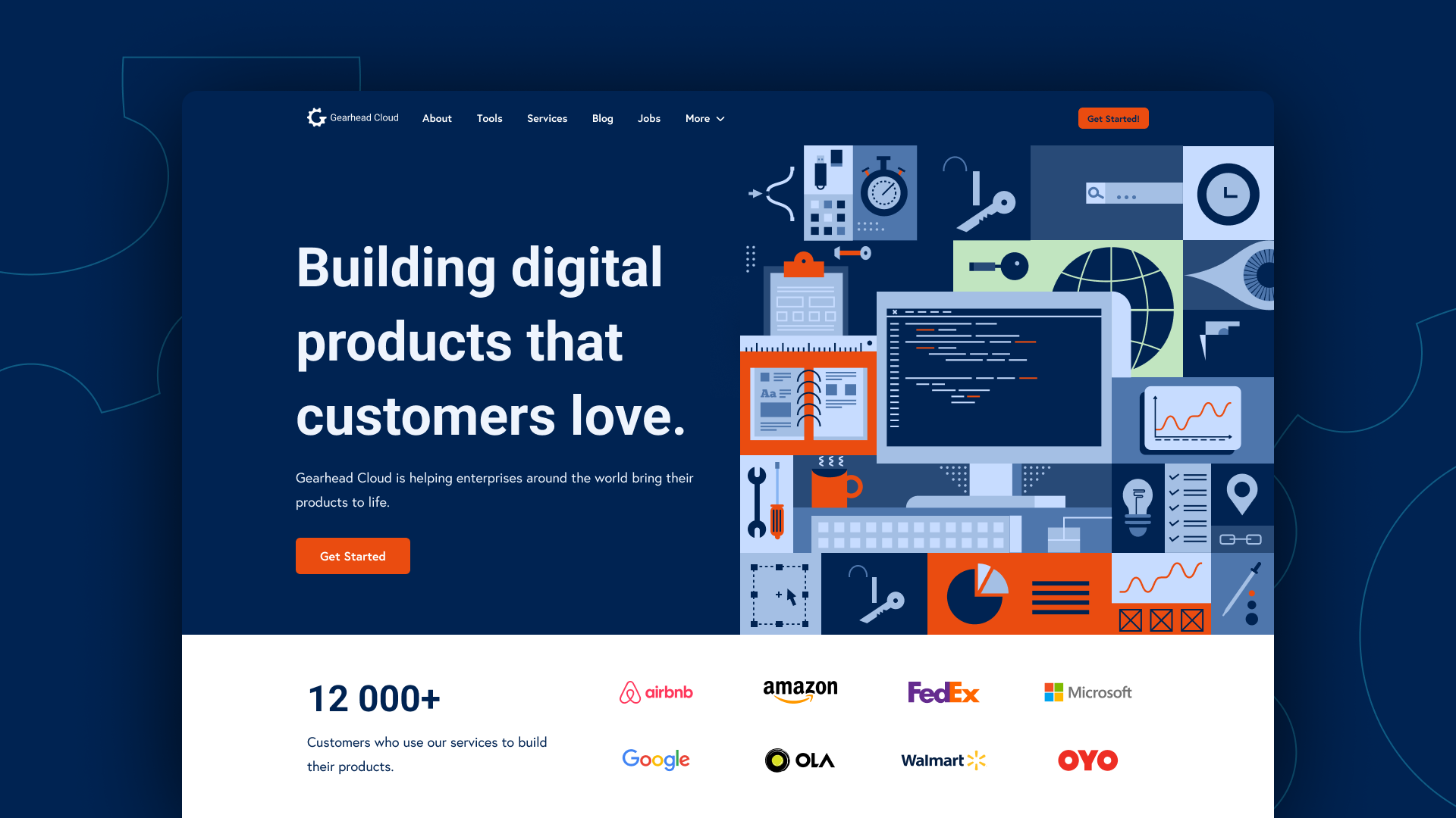
To ensure a consistent brand image, we also created an application icon with the logo, a brandbook, business card, and a one-pager that showcased the web design style as a part of the brandbook.
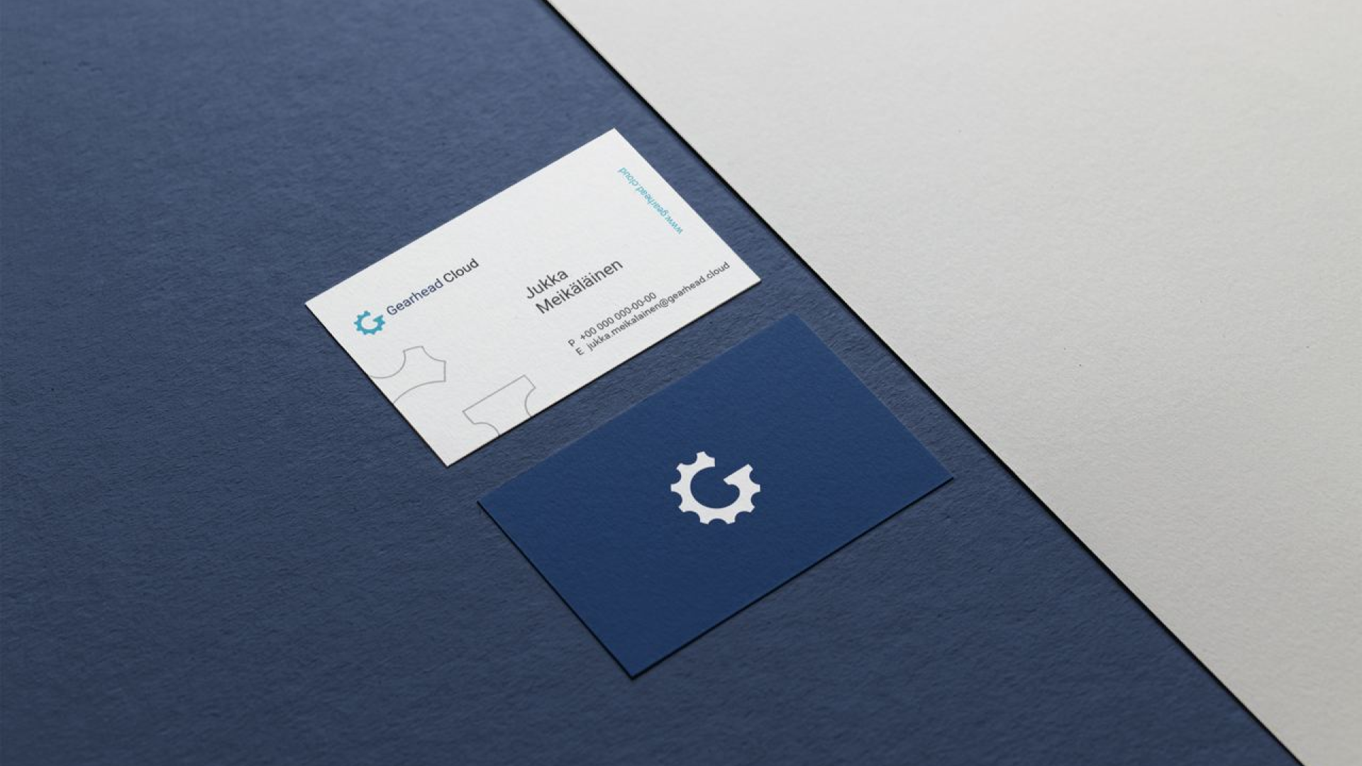
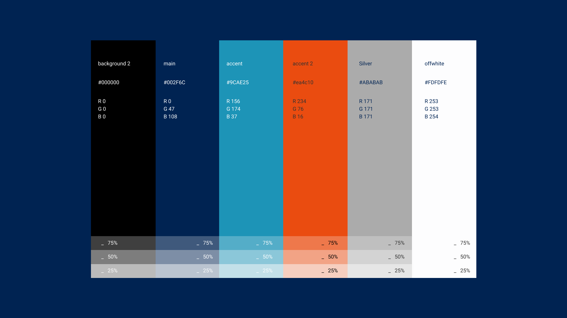
The color scheme was carefully chosen to reflect the client's preferences and avoid similarities with other brands in the industry. We used electric blue as the primary color, while avoiding similar greens, oranges, and reds from other brands.
Overall, we completed the project within the given deadline of 16 manhours and delivered all the necessary materials to the client. The final result was a professional and unique logo that met the client's expectations and conveyed the brand attributes they wanted to emphasize.
If you're looking for a professional and reliable design team for your branding needs, contact us today to see how we can help your business stand out.